
Fonts have always been something that I’ve had a secret fixation with. In a similar fashion to how someone’s handwriting can often tell you a lot about them, choice of font is crucial to shaping the aesthetic, tone, and overall quality of any piece of writing.
Typically, I enjoy neat or slightly stylised serif fonts, but I have also taken a liking to some sans-serifs. Although I have no major gripes with common choices like Calibri and Arial, you won’t be seeing them on this list. They’ve always struck me as a little ugly or awkward to read for some reason, which is ironic, because these fonts are often praised for readability.
Tangent aside, here are some of my favourite fonts in no particular order, and segmented in a very elementary ‘serif’ and ‘sans serif’ fashion.
Sans Serif Fonts
Sans serif fonts are rounded fonts designed for readability and a modern look. Since the new millennium, they seem to be used more frequently in every form of media.

When Microsoft swapped Calibri out for Aptos in 2019 or so, many people felt outraged. Personally, Aptos is a font I enjoy, and probably very high up on my list of best sans serif fonts. It looks modern and professional, is very easy on the eyes, and is just a solid all-rounder when it comes to sans typefaces.
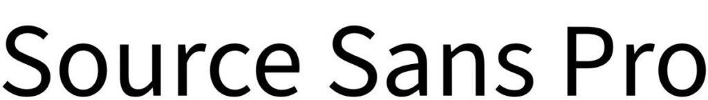
This is actually what you’re reading right now. The Steady Read’s body text is Source Sans Pro. It’s a very neat and space-efficient sans serif font, and I think it looks pretty good. It’s best trait is just how plain it is, meaning it doesn’t distract or detract from the reading experience (unlike some over-styled sans serif fonts).

Montserrat is not a font I would use for writing, but I think it looks great for visual designs that aim for a modern aesthetic. Readability can be hit or miss, but I’m sure most are fine with it. It does lack the uniform nature of most fonts on this list (note the awkward meeting of the ‘t’ and ‘s’ above), but is still an okay choice for most purposes.

A heavy, bold font is great. Segoe UI has been credited for it’s great readability, especially on screens. In fact, since the release of Windows Vista in 2006, all versions of Microsoft Windows have used the standard version of Segoe UI for the interface text. The black version is fantastic for large headings and impactful designs, not writing.

Agrandir is not really a practical font. Its thin and shapely appearance is pleasant, but it is not a practical choice for writing documents, relegating it mostly for design and illustration purposes. Truthfully, it looks great in its wide variants, but the standard version is pretty stylish, too. Simply put, it is a pretty typeface for select use cases.

Tahoma is used often, but is somewhat overlooked. Windows XP—the one that people often seem to regard as the best version of Microsoft’s OS—utilised it for the graphical interface. It’s good for writing, good for design, and is relaxed in appearance. If you want whatever design or piece of writing to appear casual, use this font.

A bit of a rounded wildcard, and not too practical, VAG Rundschrift D is a pretty and heavily stylised font. Whilst I do not think it would be a good choice for writing documents in, or even displaying body text in, it could look great when used on posters or even as heading in a document. It’s playful and cartoonish, but doesn’t go crazy.
Serif Fonts
Serif fonts contain more detail and look more classy and sophisticated. They are also great for readability, but sufferers of dyslexia and visual impairments may struggle.
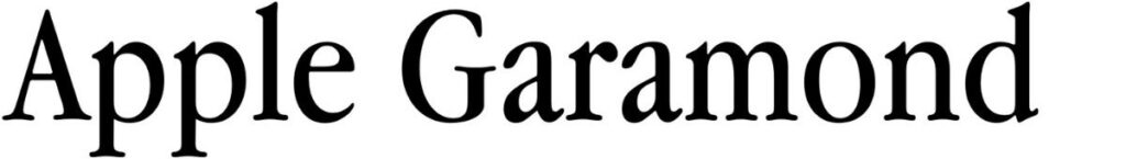
Although this list is not in any particular order, I feel confident in saying that Apple Garamond (which is taller and narrower than the default Garamond typeface) is my favourite of any font. I enjoy its classy and professional look, compact nature, and its linkage to retro computing. All round, it’s a great serif font.

DM Serif Display is actually the font used for headings across this website. I adore this font’s bold and sophisticated look, making it feel simultaneously modern and old-fashioned. This font is great for eye-catching designs and headings, hence why I use it here on The Steady Read.

For years, Cambria was probably my favourite font before I swapped over to Apple Garamond. The condensed version is great for space efficiency, but it seems that most prefer the standard styling. This is a solid, smart-looking serif font for body text. You could use it on designs, but I think it looks best at a smaller, more compact size.

Another high-ranking favourite of mine, mainly because it’s like a playful cousin of Apple Garamond. If you want documents to have a little bit more whimsy and personality, whilst also looking neat and professional, Caladea could be a great choice. You may disagree, but it is a great and easy to read font with consistent, subtle styling.

Once again, I have similar reasons for enjoying Clarendon Narrow as I do Apple Garamond—it is compact, nicely styled, and looks fairly professional. I particularly enjoy its slightly heavier weight, alongside the uniform composition of its lettering. It’s a solid choice for writing in some cases, but could be too bold in appearance for some.
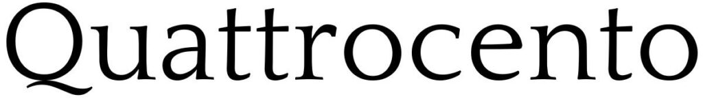
A simultaneously funky and elegant serif font. Quattrocento not only has a stylish name, but also a stylish look that would suit classy brands and business firms well. Although it does lean into its styling, I don’t think it is to an unreasonable extent, meaning one could easily use this typeface for body text or subheadings.

Ah, the classic. Many newspapers, essays, documents, books, and other forms of printed media, utilise Times New Roman. Amusingly, it has a timeless look and basically exists as the undisputed default representative of serif typefaces. It’s well-balanced, uniform, decently compact, and very readable. No wonder it’s so popular.

Lustria is a font that seems to be getting a tad more attention in recent years, but mostly for graphical designs and brand posters. It exaggerates and elongates the flared edges of serif fonts in a pleasantly restrained way. Owning up to its name, it almost has a slightly romanticised or devilish aesthetic to it. I like that, and it works for body text.

Typewriter fonts aren’t really my thing. In fact, I usually detest them for being too awkward to read because of monospacing and a lack of kerning. Courier New, however, works for me. It has a retro and soft angular appearance that balances the heaviness of its weight well. It also has links to computing as it was created for IBM.
Leave a Reply